
works
- _ 社區藝術地圖
- _ 草民音樂營 2016 / grasscamp 2016
- _ 對得起自己和時代 — 畢明
- _ 亞洲政治運動場 — 沈旭暉
- _ 粒子 — 鄧小樺
- _ Roy Cheng Artworks
- _ 井上雄彦 - 非官方浪客行展
- _ Identity Art Gallery
- _ NoseHK
- _ M18 Bakery
- _ 立村有時 Village Reimagined
- _ 草民音樂營 2015 / grasscamp 2015
- _ Lawnmap Cutlery Set
- _ EDGE
- _ 少年香港
- _ 浮誇中華
- _ 深港深港
- _ Tokyo TDC Exhibition in Hong Kong
- _ Perfection is not Concrete
- _ archives
© 2008 - 2026
_ stepconvisual identity
Stepcon Business Services Company aims at providing a wide range of professional accounting and business services with effective results to In the visual identity, it is using the symbol of It also stands as the initial “S” for the name “Stepcon”. The shape can be transformed into different form of steps to show the flexibility
* Selected work of Asia-Pacific Design NO.8 (2012) | 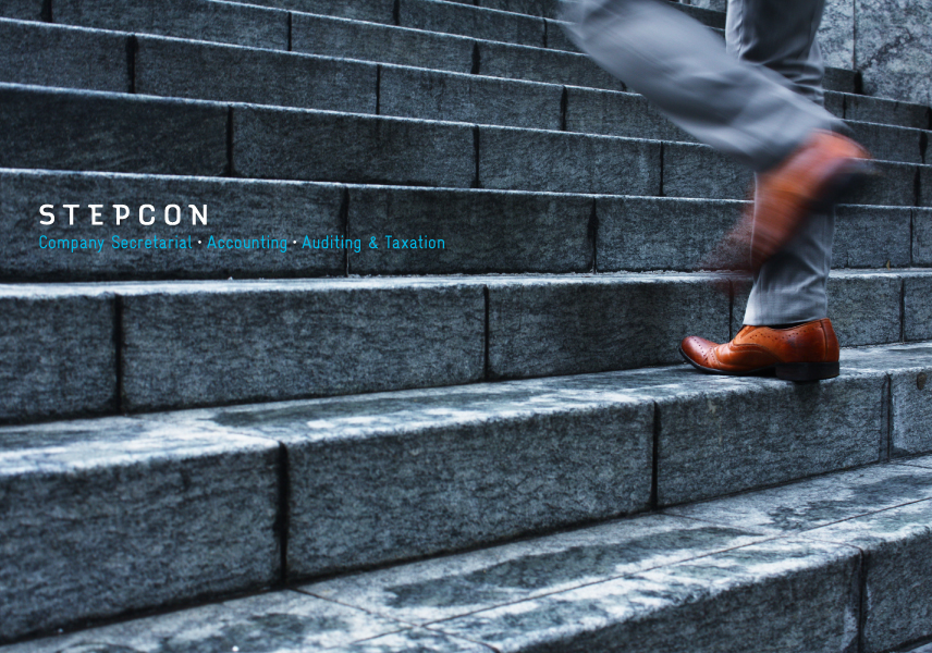 - | logo | graphic variations | 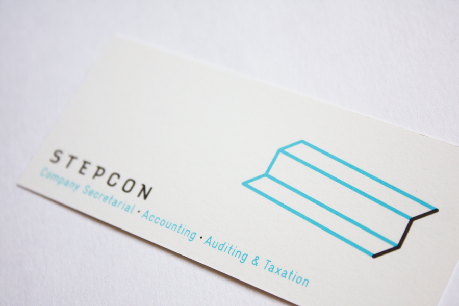 namecard | 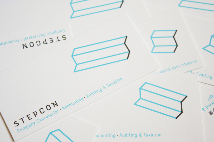 - |