
works
- _ 社區藝術地圖
- _ 草民音樂營 2016 / grasscamp 2016
- _ 對得起自己和時代 — 畢明
- _ 亞洲政治運動場 — 沈旭暉
- _ 粒子 — 鄧小樺
- _ Roy Cheng Artworks
- _ 井上雄彦 - 非官方浪客行展
- _ Identity Art Gallery
- _ NoseHK
- _ M18 Bakery
- _ 立村有時 Village Reimagined
- _ 草民音樂營 2015 / grasscamp 2015
- _ Lawnmap Cutlery Set
- _ EDGE
- _ 少年香港
- _ 浮誇中華
- _ 深港深港
- _ Tokyo TDC Exhibition in Hong Kong
- _ Perfection is not Concrete
- _ archives
© 2008 - 2024
_ EDGElogo design
書寫稜角,我們在邊緣閱讀。 EDGE 是圓桌精英(Roundtable Synergy Books)出版社旗下的新品牌,取名為「EDGE」是展現出出版書藉具其獨特性的取材,以及前瞻性的視野。 設計商標時故意用微微打開了的書本側面,書頁末端再和英文字 E 配合,帶出其走向偏鋒的視野和對事物的挑戰。 EDGE is a new publication brand created by Roundtable Synergy Books. It provides a specific viewing angle from the editors. The concept of the logo is based on the edge of the pages from book. By combining with character “E” and the side of edge, it provides the touch of the flipping paper. | 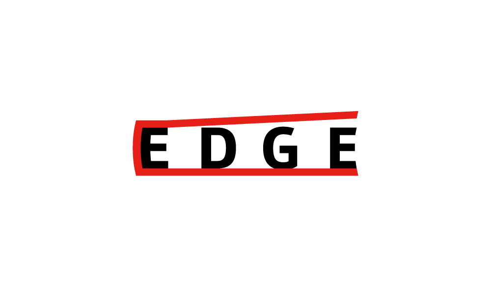 - | 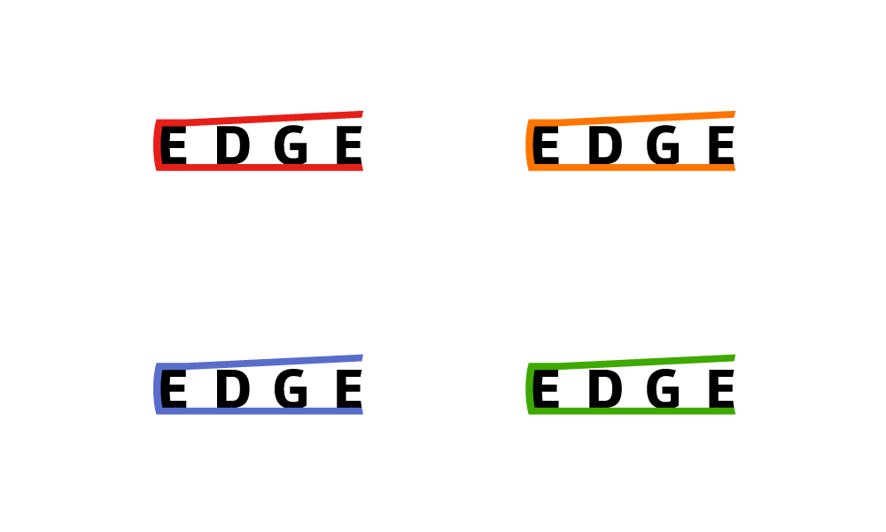 colour variations | 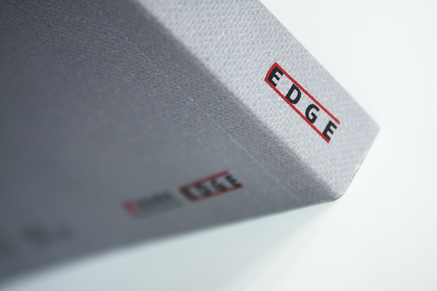 - | 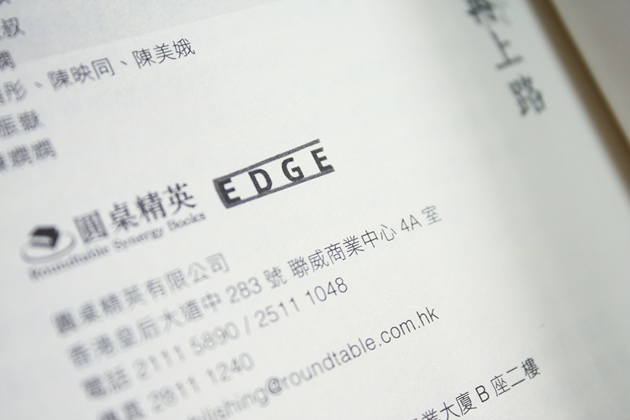 - |